té
té
DESIGNING A CLOTHING BRAND
Brief
For this project, I was tasked with modeling any kind of product or service based on my identity. For years, I have followed and participated in the fashion industry- so I chose to design a clothing brand that represented me. It was difficult.
From creating the foundational visual brand to creating products, I learned how to model brands and use visual skills to communicate identity and beliefs.
Brand Identity
Crafting a brand is just as much about the user as it is about the brand, even when you are the brand.
Queerness, courage, and integrity are pillars of who I am and others I look up to. Thus, I chose these as modeling factors for my brand identity. However, exploring the te’ brand identity was beyond thinking of our values and mission- I also had to ideate on my target audience, and measures of success (given that this was a prototype project, KPI’s such as profit and purchase were out of the equation):
being authentic. having fun. always exploring.
The world constantly bombards us with narratives to sell,
filters to live our lives through,
and identities we should mold ourselves to.
We believe it's time to write your own narrative.
Our mission is to create a brand that creates clothes that are real,
and less defined by the norms of gender and 'style' that encage modern-day fashion.
It's up to us
to change the culture of mainstream
so that anyone can be comfortable in their authenticity.
Brand Design informed by…

Logo Identity
Any brand needs a simple, eye-catching logo that defines the first experience users have with the brand.
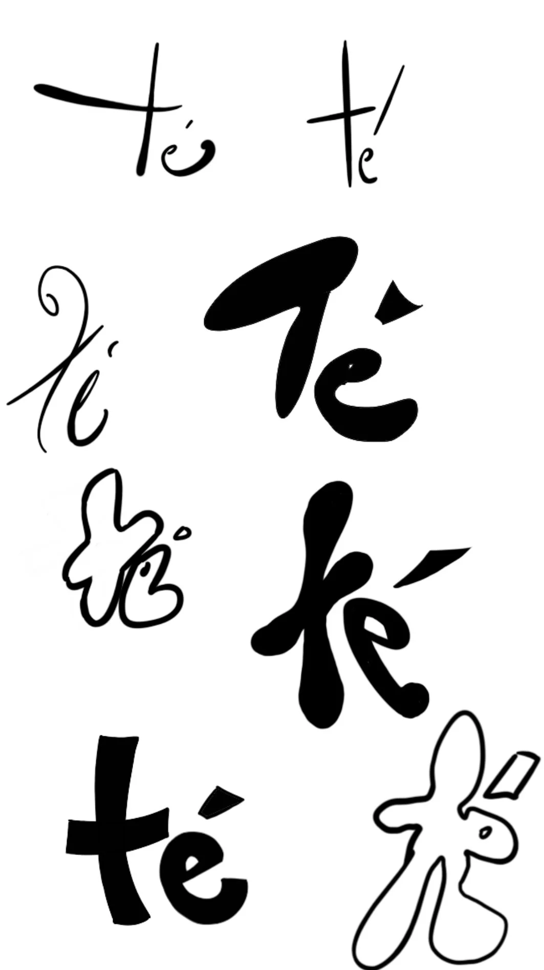
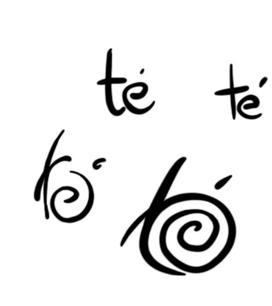
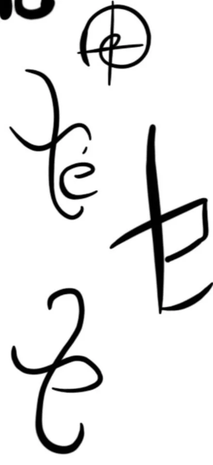
The first step in creating the best logo was about making as many dynamically different iterations as I could think. The brand and brand story were very intimate to my own discovery with clothing, so I wanted to imbue the logo with my identity as well. I chose to handwrite the logo as well, to incorporate implicit elements of my self-expression. However- this was paired with critical review from my peers and mentors to assure that I was communicating the brand values.
Thus, I came up with the idea of using my initials.
Building User Narratives
How can we spotlight different user stories in just a picture?
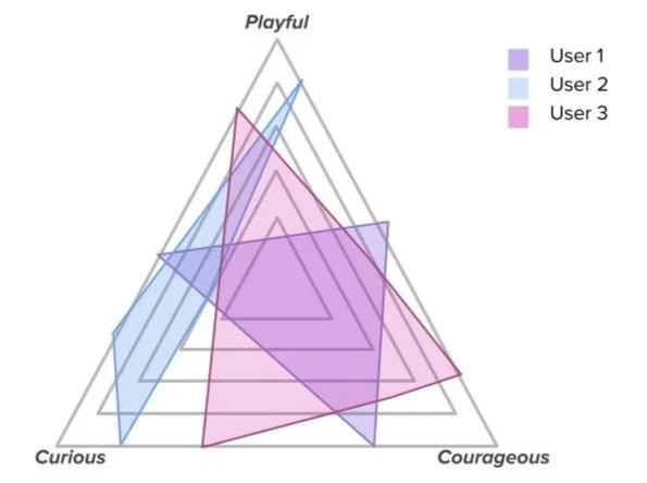
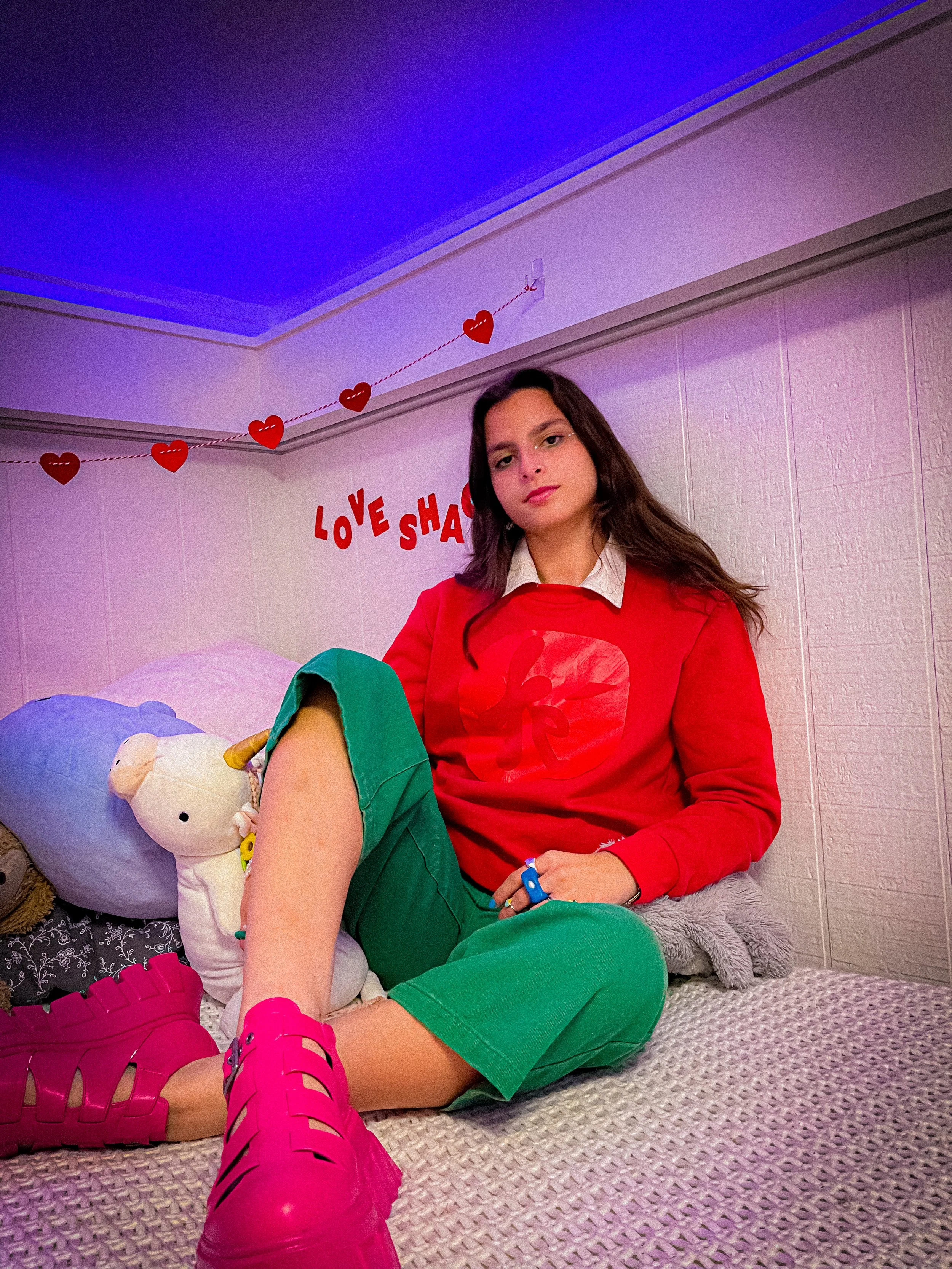
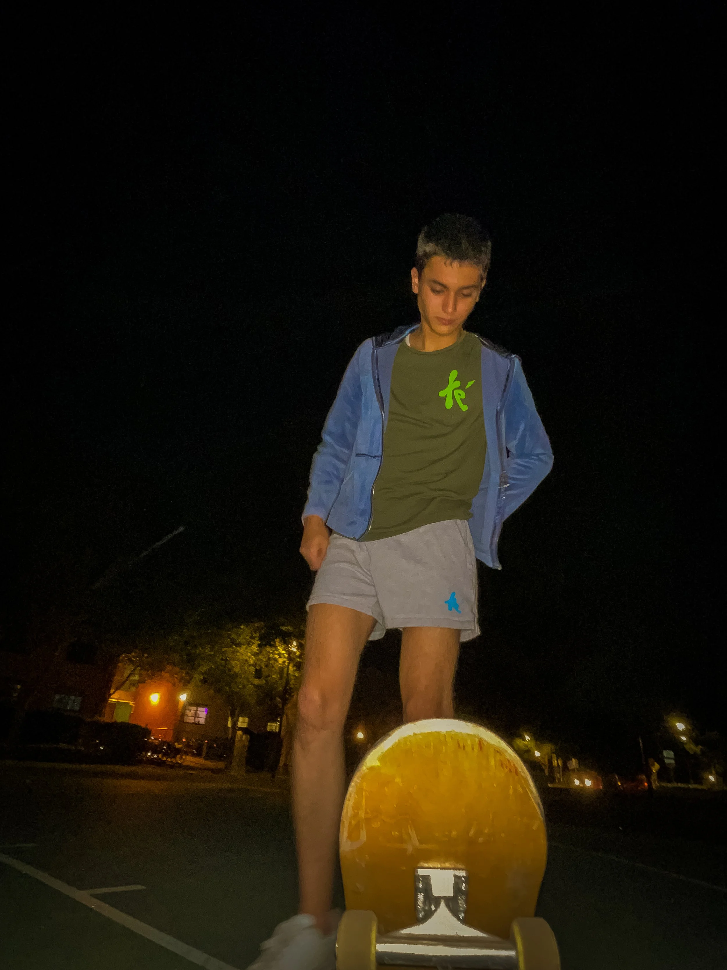
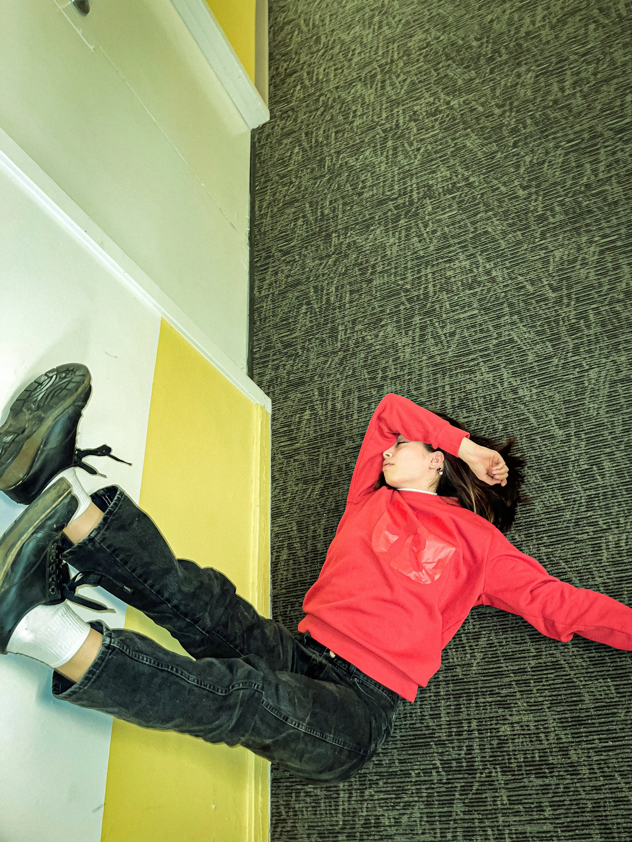
Creating a unified product story was central to brand identity. Our product narrative was told through the lens of different target users. I wanted to illustrate the full spectrum of people that I’d want to be a part of this project- from completely goofy individuals to others who are more serious but maintain their integrity. Building user narratives was all about leveraging these personalities of different users (i.e. what different “vibes” do different students have?) to engage different target audiences that varied in gender, aesthetics, and lifestyles.
I used data visualizations to assess whether the qualitative data from the personalities of the users fulfilled this triangular model, representing the different combinations of desired traits that matched the brand story.
Tools used: Autodesk
Tools used: Adobe Suite
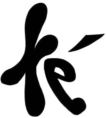
Furthermore, both letters were designed in lowercase with rounded edges- to illustrate the playfulness of the brand. There is also a human-&-partner motif in the silhouette that I played up for some logo sketches, but chose to minimize for the final design as I found it gimmicky.
I was very inspired by letterforms for brands like Univision- that bring a distinct silhouette. Even universal design principles like the use of diagonals to guide the eye were considered for the logo.
Ultimately, I chose my final design based on the above criteria and on clear execution of brand values:
authenticity through the use of my initials and a stark silhouette with a solid, single color
playfulness and exploration in the rounded corners of the letters and the flow of the strokes
a tinge of reality modeled by the blade-like tilde that balances the overall playful message, representing the wits of the brand
Visual Design
Forming a true, sticky story alongside the brand was crucial to creating a brand identity and demonstrating brand values. For this project, telling the te´ story implicated developing key clothing designs and supplementary visualizations that echoed our core values of authenticity, self expression, and fun.
Complementary Visualizations
Developing key visuals involved setting up a hierarchy of design principles. Design aspects like typography had to remain consistent throughout, and attaching colors with different stories emphasized the importance of color in the design ethos.
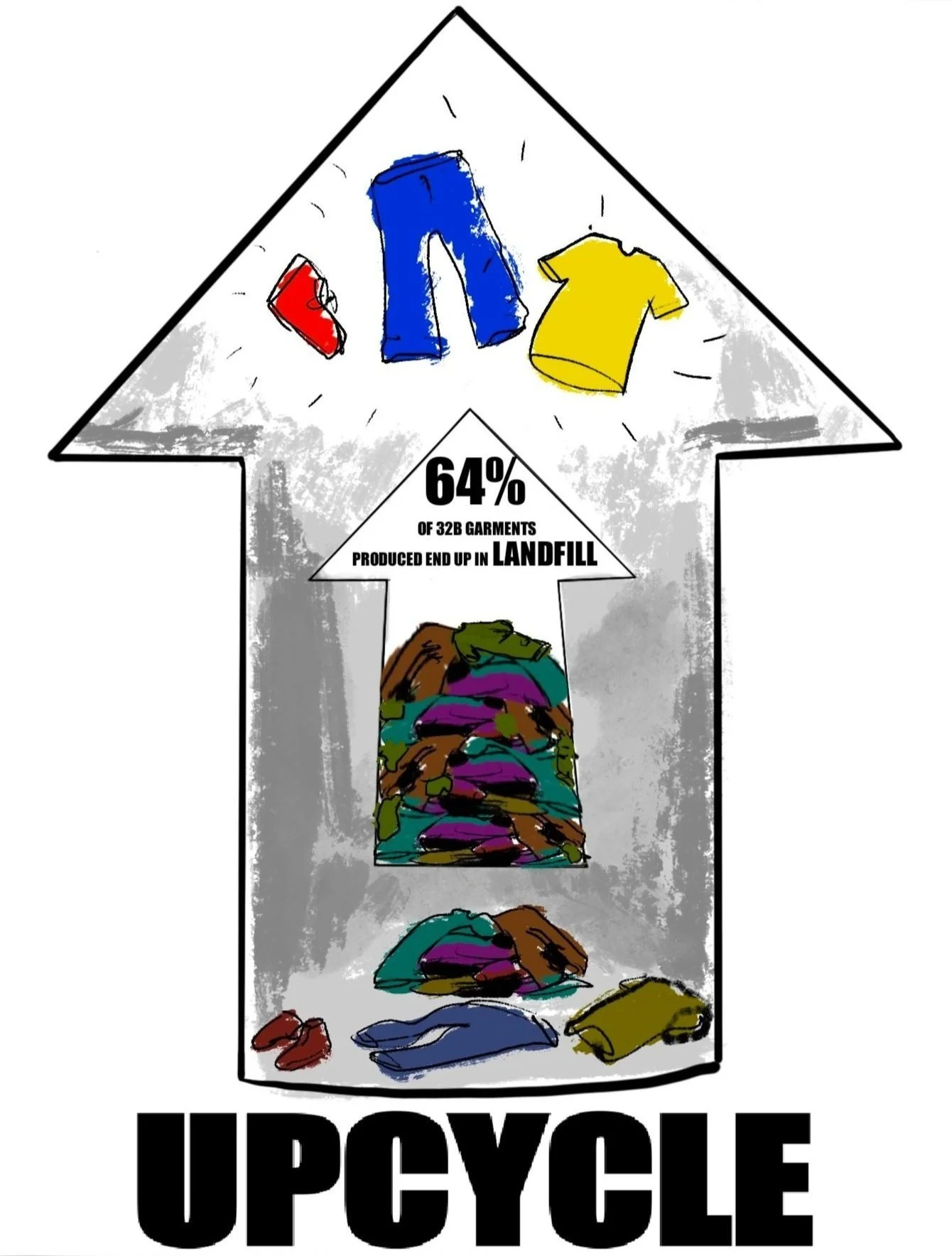
Designing the adjacent posters involved heavy use of the aforementioned guiding principles. For example, consistent line spacing, boldened text, and font were maintained throughout each poster. And, in the context of each separate design, different color stories highlighted different tensions (i.e. gender differences and ‘new versus old’).
With every illustration came a distinct purpose and contribution to the brand. Each visual was meant to bring up relevant data, such as recycling data on clothing, in a context that was relevant to the brand and brand values.
Terminology and text content were leveraged to connect with target audiences. In the left poster, curse words are used to illustrate the magnitude of the relevant issue regarding gendered fashion.
Tools used: Procreate, Autodesk
Through text animations used in commercial content, I emphasized the raw-ness of the brand. The white writing on black screen communicated an edgy feel, and the different writing paces illustrate and emphasize different words. Furthermore, such writing keeps the core consistency of the brand typography and design hierarchy that originates from my handwriting on the logo.
At its core, these handwritten visualizations present a rebellion to ‘structured’ marketing- the kind of visual design that hides itself in apparent carelessness and spontaneity.
Product Design
Ultimately, the brand stands on its product value. While the scope of this project was towards a high-level brand prototype, it was imperative to visually deliver a clothing product consistent with brand beliefs.
Everyday-wear was chosen as the starting place for designs, to hone in on younger audiences and the concept of ‘living’ in te’.
All merchandise was unisex, and modeled as such.
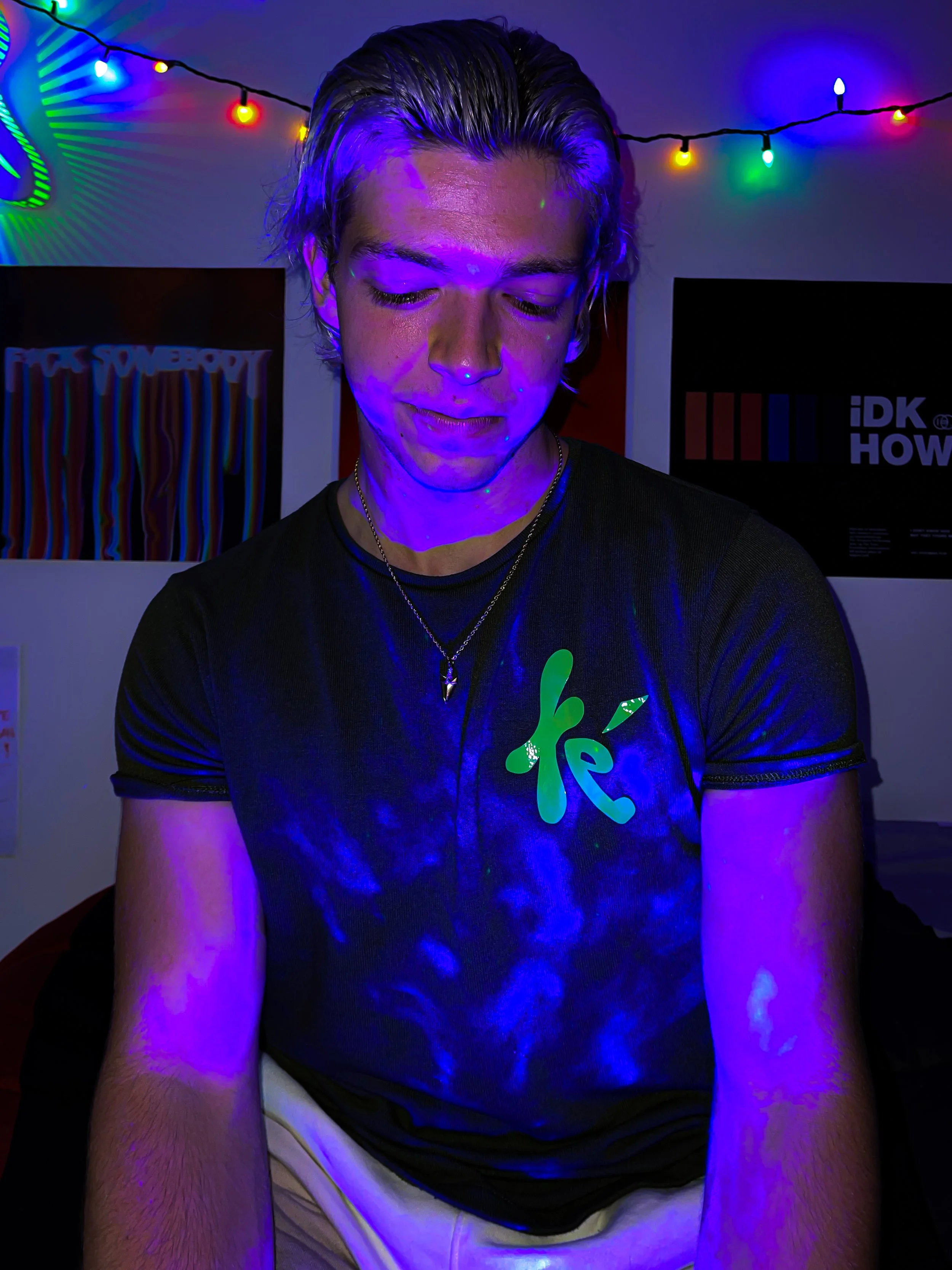
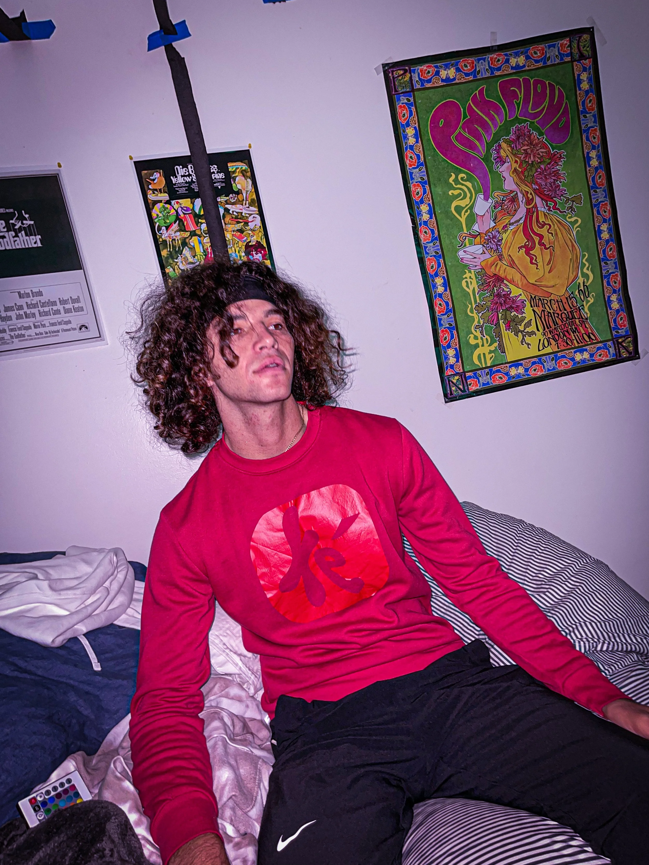
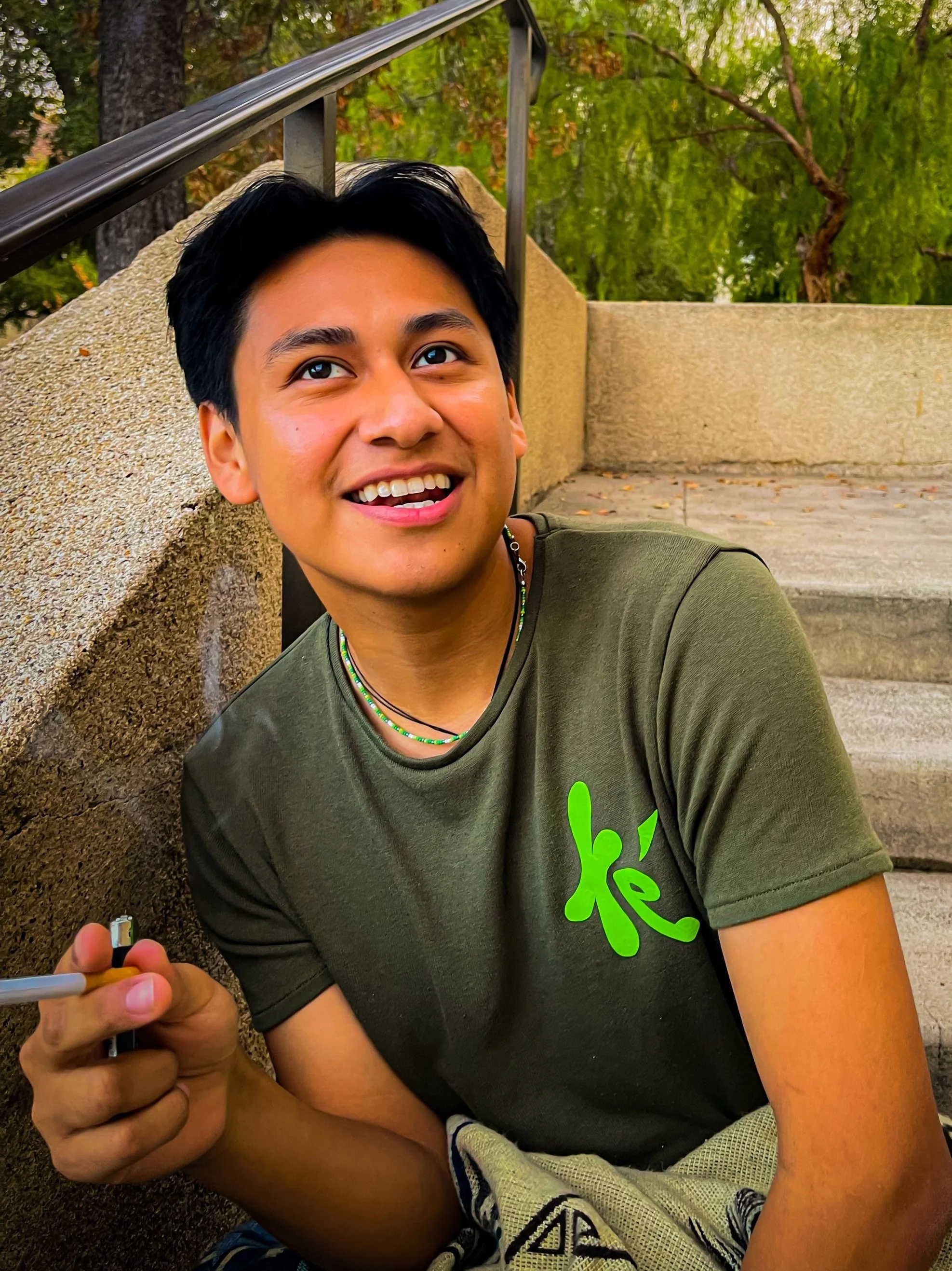
Saturated, bright brand logos stuck out in all designs to re-emphasize brand playfulness and the courage of playing with color.
Strong content words were chosen to pop-out to users. Once again, a nod to the ‘rebellion’ towards the status quo of everyday fashion.
Tools used: Figma, Autodesk
Video Design
The brand narrative culminated with a commercial that made use of the aforementioned visual designs and products- from the models to the clothing prototypes. Furthermore, the use of multimedia access (i.e. sound, visuals, etc) allowed for a more immersive experience for users to consume and understand the brand at its core.
Extreme light setups are used to create visual engagement for viewers, and to complement the colorful nature of the fashion designs. The presence of saturated and varying colors and lights were significant as color is innately distinct and firmly present. Thus, the emphasized use of color throughout each clip, which was further saturated in post-film, represents the different identities of users while, on a superficial note, nodding to the playfulness of the brand.
Clips were used from user interviews I conducted to showcase each user’s distinct persona and their beliefs. These clips were taken in different places, from campus parks to student dorms, to illustrate the different contexts in which users will use the clothes as well as creating vulnerability and closeness between the brand and users. Users believe in the te’ product, so they trust the te’ brand and allow it into their school, their dorms, and their lives.
Tools used: Autodesk, Adobe Illustrator, Adobe Photoshop, Adobe Lightroom, Adobe Premiere Pro
