Closing the loop on Amazon purchases
At Amazon Style, I was figuring out how customers could access items they saw in-store but didn’t purchase.
Context
Problem
Role
I was designing for the Amazon Style experience, Amazon’s first-ever physical apparel store. Style integrated machine learning for hyper-personalized shopping and re-imagined fitting rooms. Additionally, we were pivoting the experience from a show-room style store to a regular apparel store layout.
Customers had no trace of items they interacted with in-store, unless they bought the item.
UX Design Intern, part of a six-person team of UX Designers.
Product Discovery
Primary & Market Research
I visited the Style S1 store in Glendale Mall to
Find friction.
What did I have problems with?
What could I observe other customers have problems with?
Rack of clothes in the showroom, where customers can scan the QR on the hanger to request the item in a styling room.
Findings
Frictions
Customer Journey
Show Room.
Customers don’t view the main floor is a show room. They don’t realize that items are available in different colors, or more sizes.
Customers do not scan, nor understand that a QR code
Customers try to physically hold onto items, even when they know they can scan.
Styling Room.
Wait time feels long for customers.
ML recommendations feel off/inaccurate.
Key observations led to the finding that customers felt stuck.
Through the store, these were the only interactions possible, all of which where high-stakes decisions.
There was no low-commitment way to digitally consider an item, like a cart.
Customer Mindsets
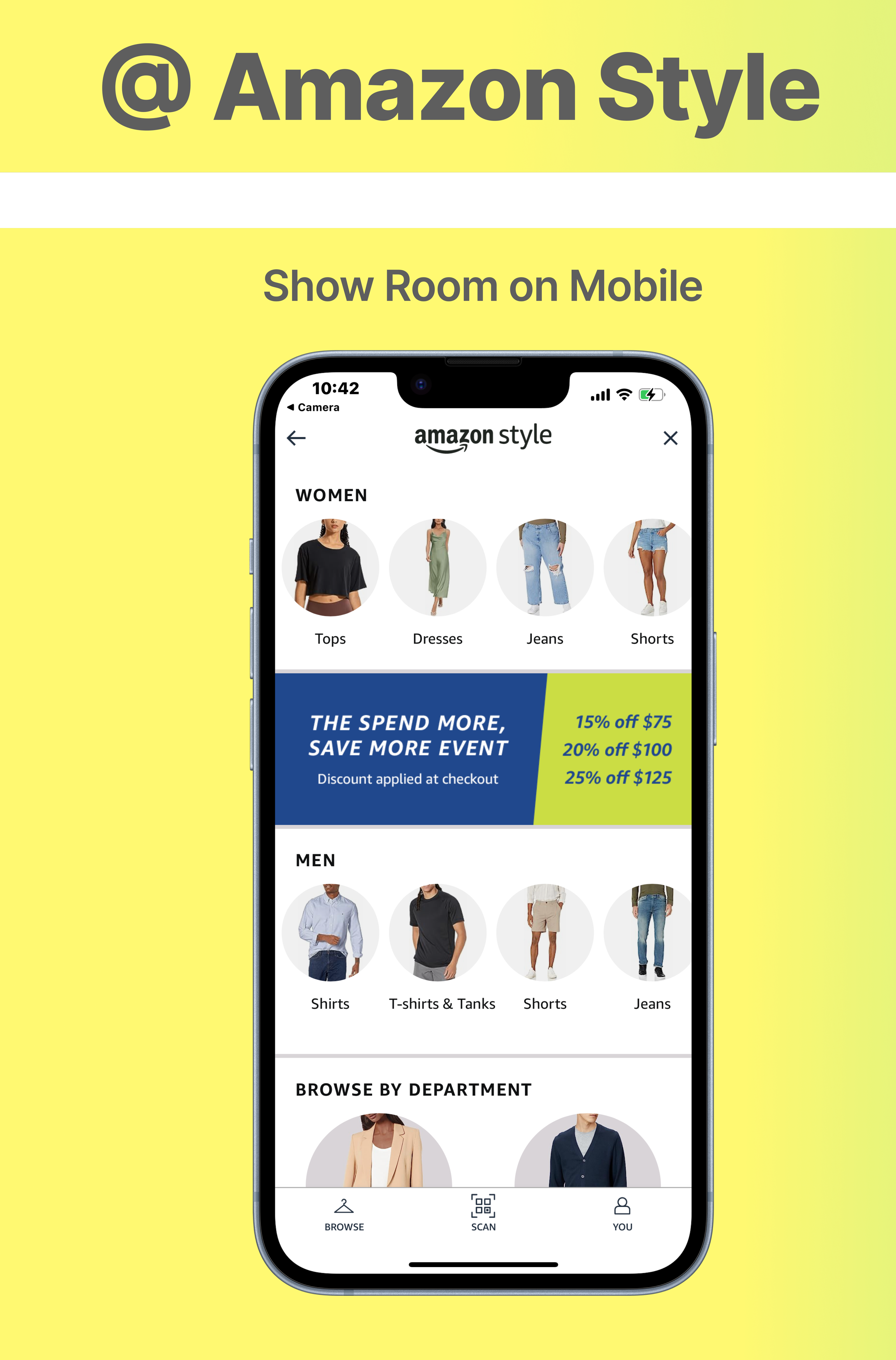
Landing screen of Style “in-store” mode when scanning a QR code from an associate.
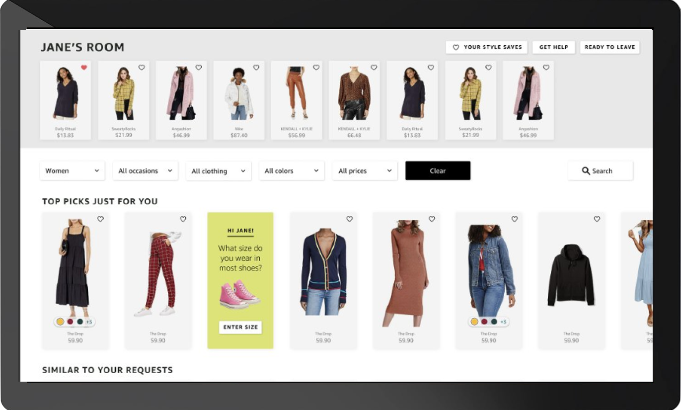
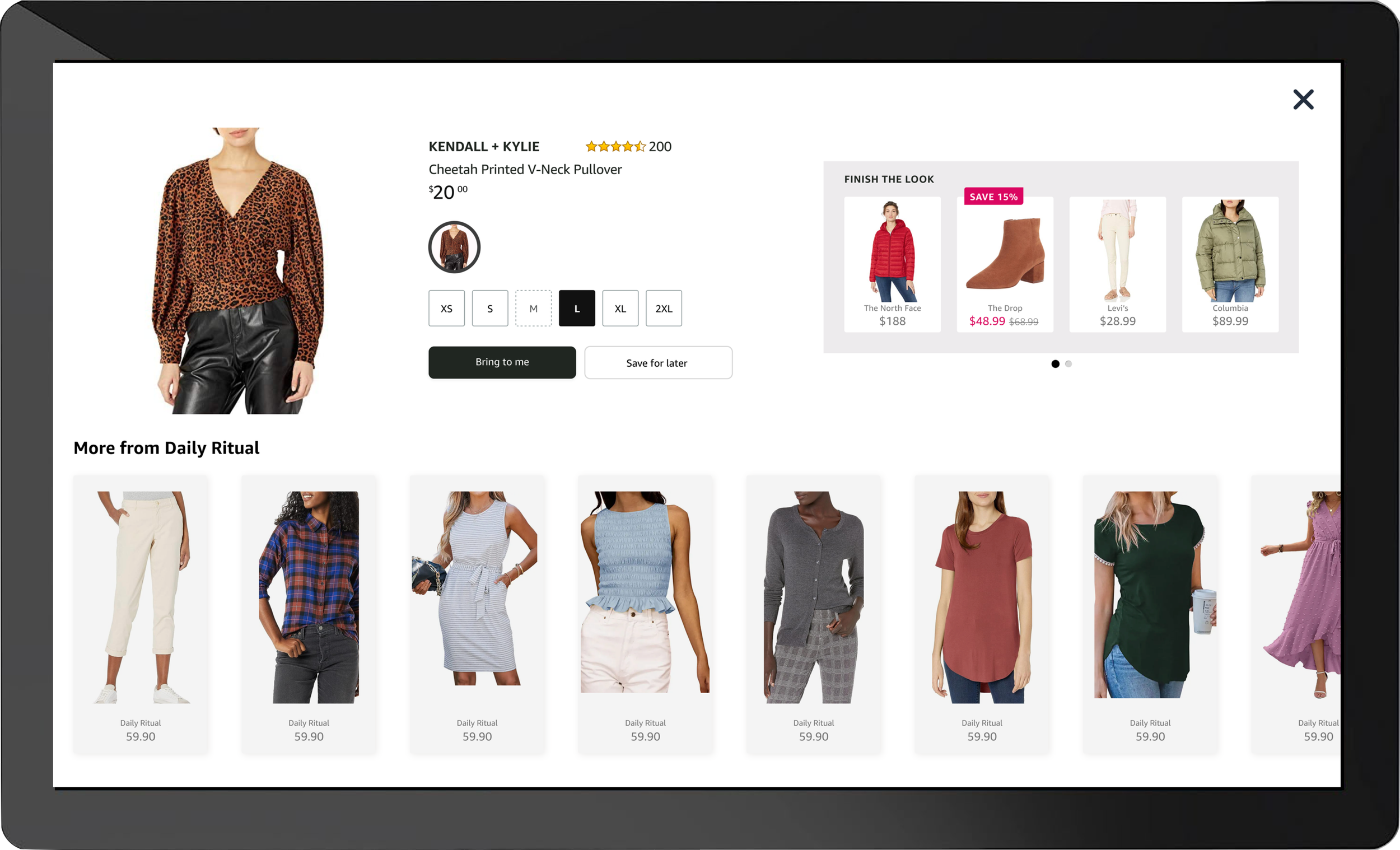
Inside a Styling Room; closet to left and tablet to the right, as well as a drawer on the bottom to leave clothes you don’t want.
Post-Checkout/Styling-Room
Customers leave items they’re uncertain about.
Many customers leave upon scanning, as their only options are to try on an item.
Out-Of-Store
No journey. No experience.
Furthermore, outside of the store, there was no experience for users. There was no way to revisit items they saw in-store.
After a customer left the store, they had no connection with us. And we had no connection to them.
Putting these two finding together, I identified an out-of-store focus for my project, based on the opportunities for:
authenticating users
higher personalization through endless passive interaction with ML recommendations post-visit
engagement with Style post-visit, which is sought out by some customers
connecting users to their in-store interactions (i.e. ‘maybe’ items)
I identified 8 different customer mindsets to contextualize and narrow my brainstorming.
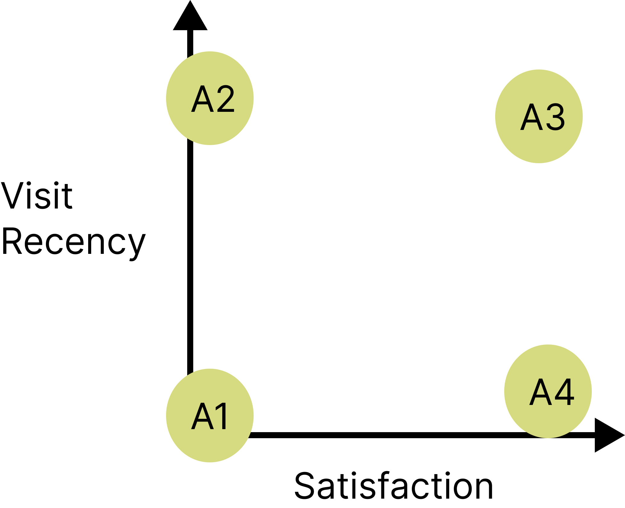
Visited 1x
Understand customers’ mindsets.
How did customers change from entering to leaving the store?
A1: Just left store and unsatisfied
A2: Long time since only visit and unsatisfied
A3: Just left store and very satisfied
A4: Long time since visit and very satisfied
Familiarize myself with the Style experience.
From the front door to checkout, what am I engaging with? What calls my attention, and what doesn’t?
What makes my experience difficult, and what makes it seamless?
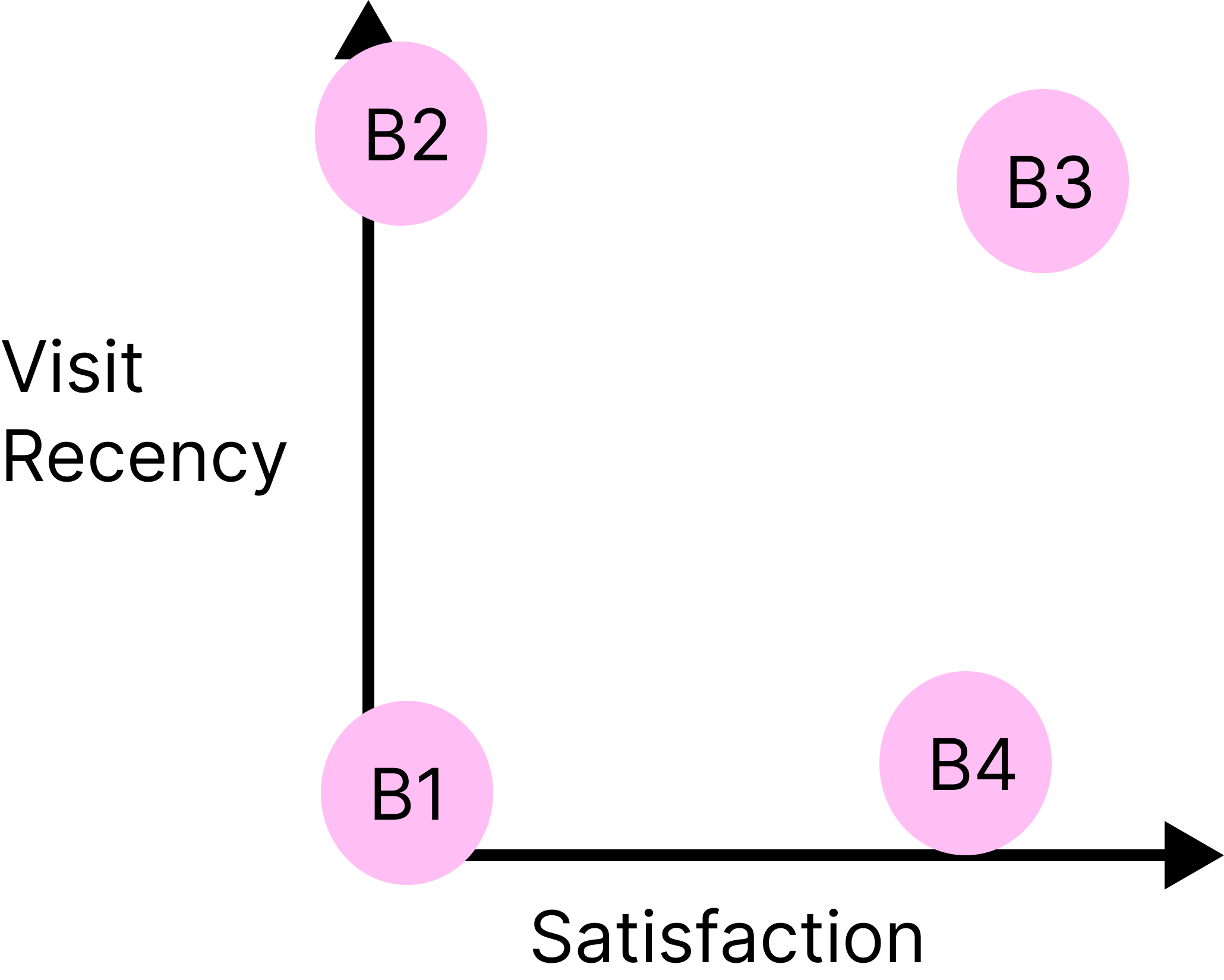
Visited > 1x
B1: few but frequent visits
B2: lot of time between visits, few visits
B3: a lot, and frequent, visits
B4: a lot of visits with a lot of time in-between
Product Ideation
Narrowing In
We brainstormed for out-of-store challenges:
As a customer on Amazon at home, I want to find an item I viewed at the store.
As a customer on Amazon at home, I want to find an item I purchased at the store.
At Amazon, we used narratives to flesh out user experiences early on, before prototyping and testing.
Narratives were primarily useful for aligning with different stakeholders on key experience components & understanding core user stories for features.
Below is a shortened version of one of the central one-page narrative proposals I crafted for an out-of-store mode. The narrative prioritized the first challenge: revisiting an item viewed at the store. The narrative is accompanied by the actualized prototypes.
The prototypes are informed by feedback from narratives, and do not fully match the narrative UI descriptions. The main jump from narratives to prototypes was the incorporation of a heart icon.
Joan & her friends discover the Amazon Style store and decide to explore it. In the show room, Joan sees a shirt she's interested in and scans it with her phone.
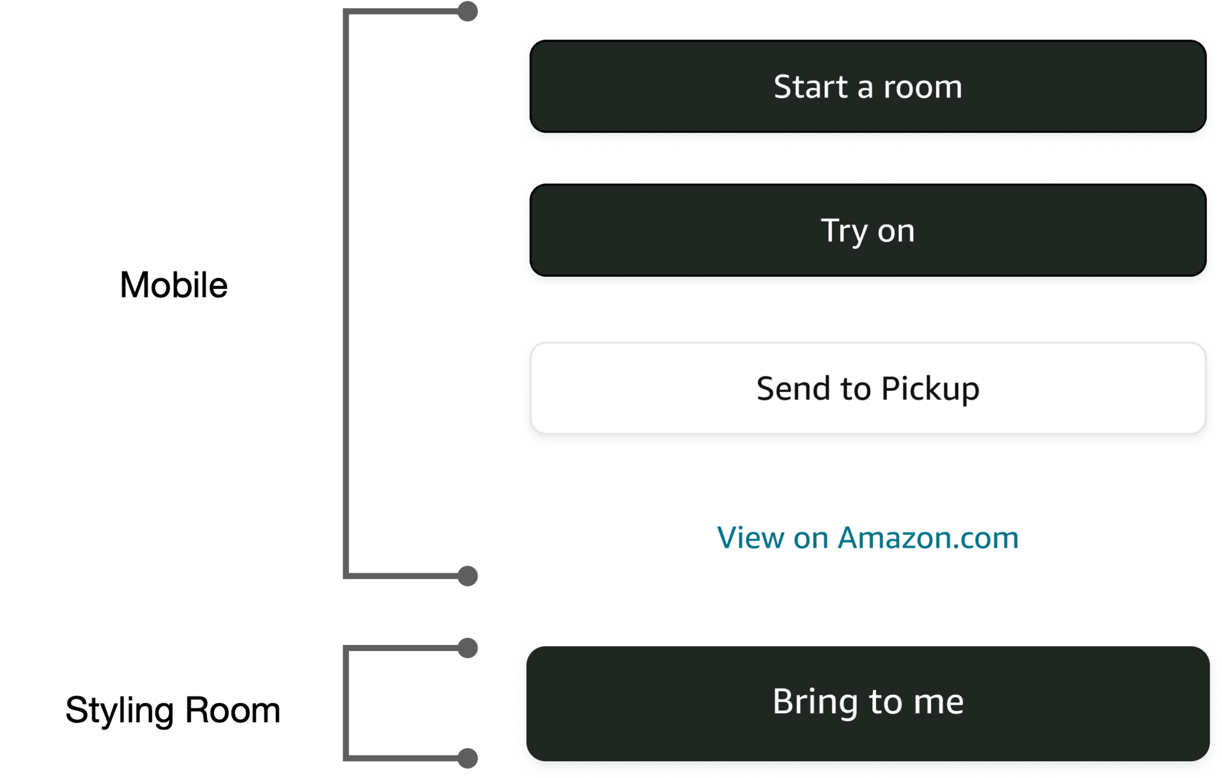
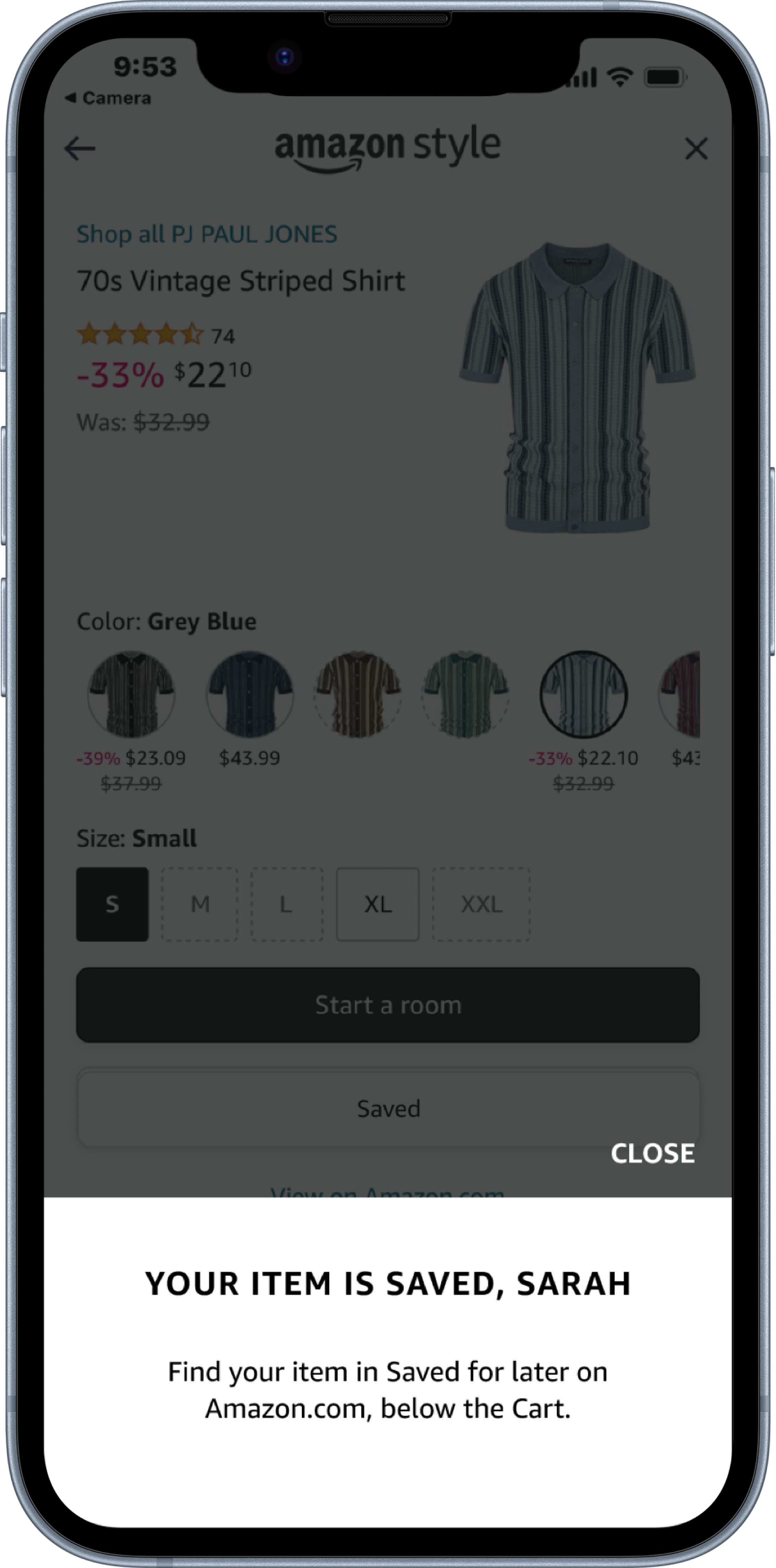
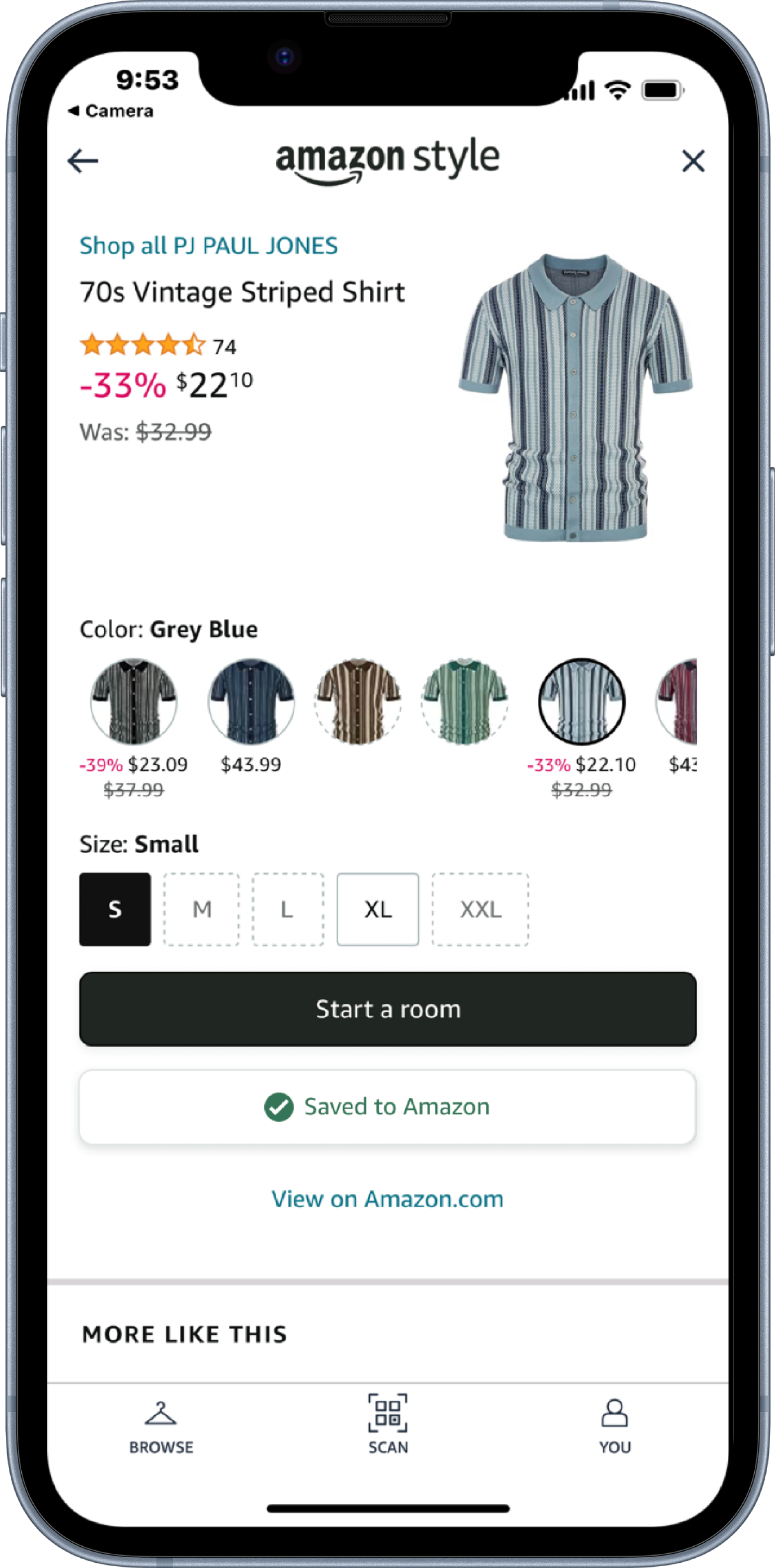
She likes the item, but it seems like her friends are ready to leave the store so she taps on the “Add to 'Maybe'” under “Start a room” button.
At home, Joan receives an Amazon notification asking if she is still interested in her “Maybe” items.
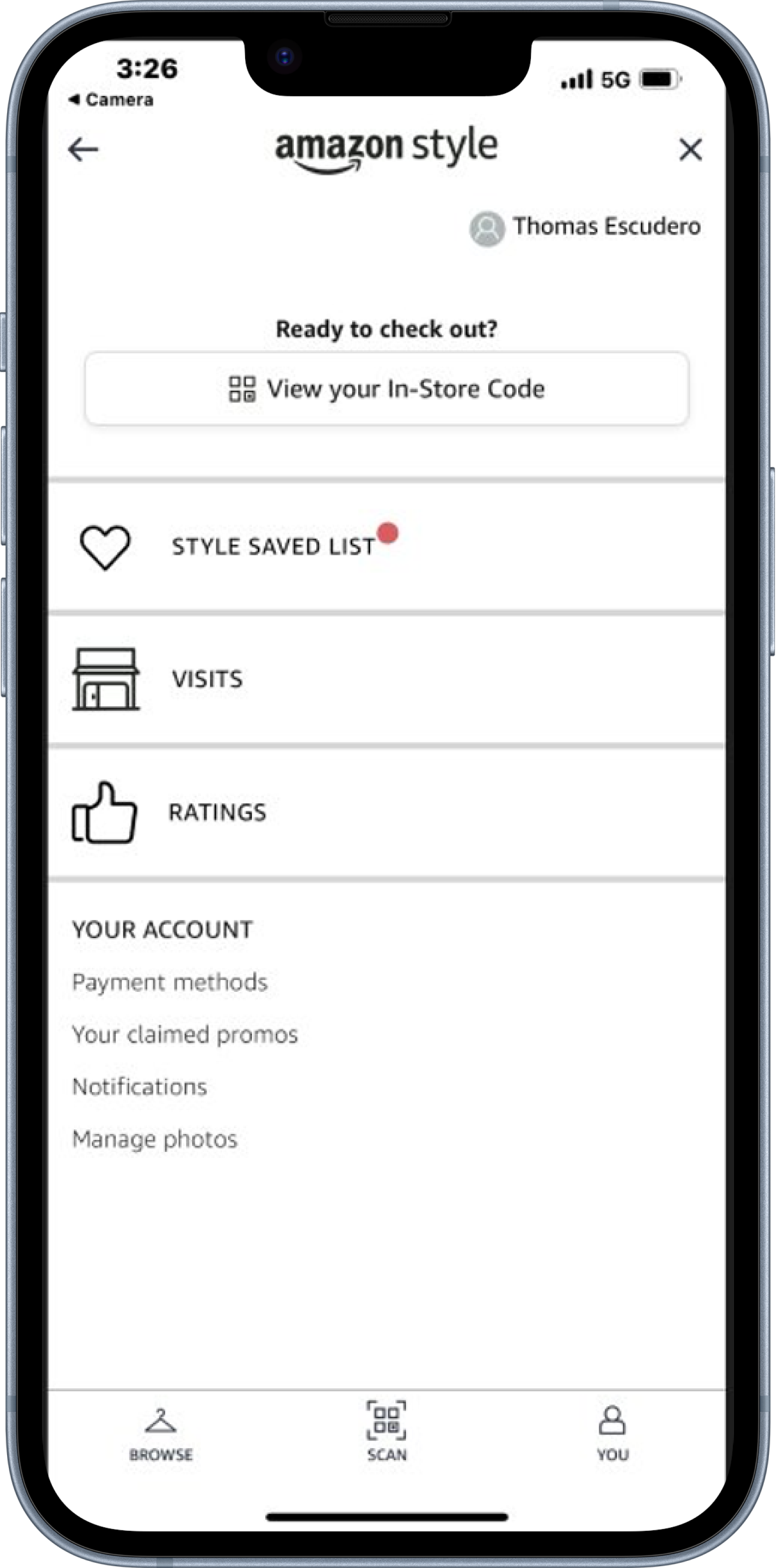
Her “You” tab is now lit up with a system marker noting an update to the Maybe List that sits as a tab between “Visits” and “Ratings”. Joan and her friends head out of the store and go back home.
Clicking the notification on her phone takes her to Style mode within Mshop and into a screen titled ‘Maybe List’ with a vertical scroll containing the shirt that Joan scanned.
Through narratives I was able to explore a full-fledged vision of an out-of-store user experience. My goal was to develop this feature up to an engineering handoff, so I prioritized the essential components of this experience:
In-store & fitting room components, and an at-home component.
Product Testing & UX Research
Testing Plan
Mobile Store Mode Prototype
Styling Room Prototype
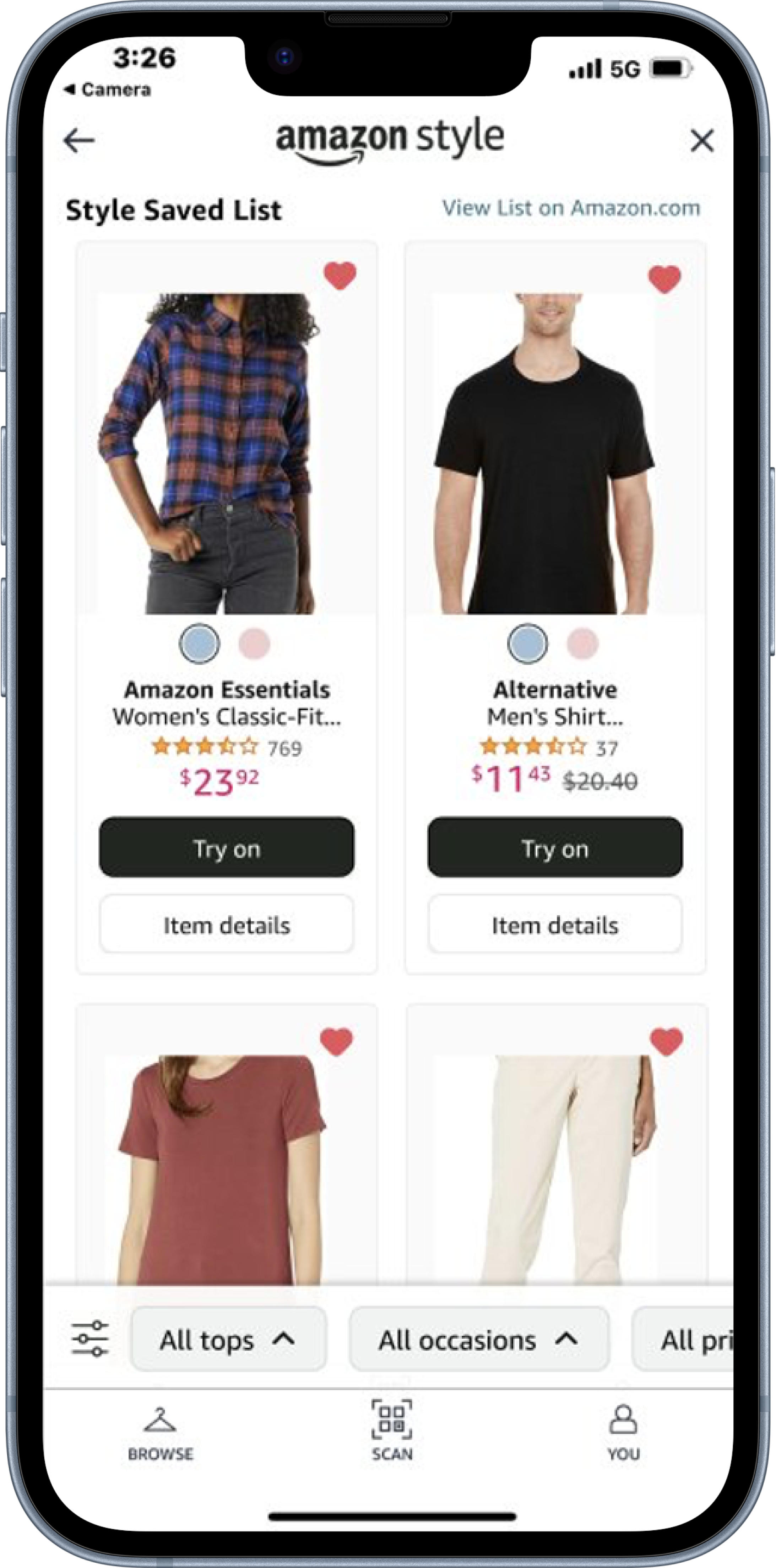
The styling room screens shown below show the homescreen hearting experience, and the styling room widget for a customer to see their Style Saves List.
Findings
I led 45-minute usability tests with follow-up interviews for 15+ participants at our Amazon Style replica store. The central goal was to evaluate the usage of a heart icon as a new item interaction. I evaluated the success of 3 tasks:
Navigating store mode customer experience from associate QR gateway.
Scanning an item they like in-store and saving it.
Asking users to find their list post-visit.
Limitations:
Lack of post-visit timeline: we cannot observe the development of customer attitudes post-visit and what kind of actions they would take in a post-visit environment at home.
Users cannot live-scan any item in the store: instead, they have to choose from a selection of items available at test site that are synced to the prototype.
Study Goals
1. Do users value in an in-store feature to save an item, and is a heart icon an intuitive format for this.
2. Evaluate the user transition from store mode to Amazon-.
3. Gain a high-level understanding on how this impacts the customer’s mental model regarding item saving pre-visit, in visit, and post visit.
Testing Media
Hypotheses and Assumptions
• Customers have items that they want to save for later.
• Customers may try to use the Saved List to keep track of items they like in their visit without having to try them on.
• Customers can easily understand how to find the Saved List in-store with the help of a tooltip.
• Customers will understand that their saved list is cumulative and sticks with them post-visit.
• Customers will scan-to-shop and digitally interact with the item.
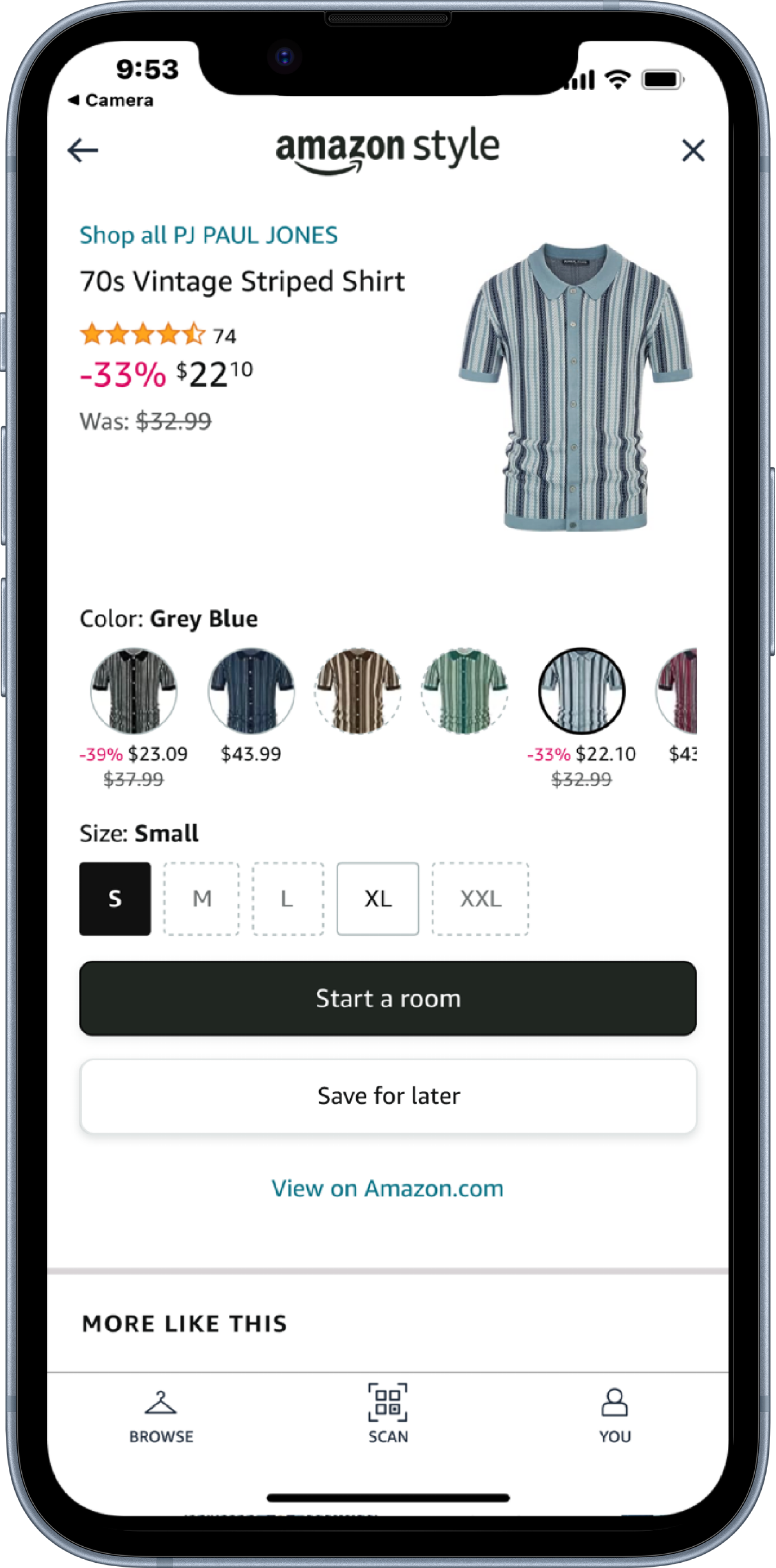
These two screens represent the hearting experience in the Landing Page & Item Details Page.
Let's get rid of the heart icon.
1. Testers did not actively seek to save items for later (see A.2.). However, they would appreciate system inputs that track their item interactions & reminders/guidance post-visit to revisit items they seemed to like (C.2).
2. Testers seek a way of filtering browsed showroom items with items taken to the FR.
a. See: A3, B2
3. Testers may appreciate a post-visit receipt/summary of items they interacted with and didn’t purchase.
A. Mobile In-Store mode
Testers understood the heart icon functionality.
Testers perceived hearting an item as a distanced and potentially unimportant interaction.
Testers differentiated between a cart and save for later.
Testers sought an option to add items to a cart.
Placement of list on prototype is intuitive and consistent with Mshop.
Testers would have liked to see all of their list items that are in store.
Prototype-specific feedback:
a. Sorting mechanism & further information on List (i.e. sort by recency, total price).
b. Save Pop-up is too quick.
Key Questions
• Is this feature useful to in-store customers? What are some reasons/drivers for customers to use this feature (i.e. out-of-stock)?
• Do customers understand the intended functionality of this feature? If not, how else may a customer use this feature?
• How smoothly does our current design lead customers into Mshop post-visit?
These screens illustrate where the list of saved items was shown on the mobile store mode.
B. Styling Rooms
Heart on PIC can be confusing, as testers may think that all of the items in their room are favorites.
Testers understood that hearting in the Showroom translates into the FR.
Testers had mixed feelings about hearting items in the FR.
Testers would have liked a mechanism to pay for items in the FR/leave with items similar to Fresh.
Testers wanted post-FR access to their FR screen.
Prototype-specific feedback.
a. Green initial pop-up used to educate customers on the function of hearting was not seen by testers.
C. Post-Visit
Customers want a visit summary/receipt.
Customers would enjoy post-visit interactions that influence future Style visits.
D. Other
When shopping on Amazon, Cart or Saved for Later are used as ‘favorites’ mechanism.
“Get Help” FR button misinterpretation.
Amazon Style is not always perceived in direct connection to Amazon.com.
Next Steps
After evaluating in-store customer shopping behaviors I proposed a split solution aimed at the opportunity for enabling passive revisiting and active revisiting.
Passive revisiting refers to the notion of revisiting items after your visit, based on the customer desire to have access to items they interacted with in-store after their visit without explicitly choosing to save the item for later.
Passive revisiting would be enabled through out-of-store accessibility of our in-store mode Visits tab.
Active revisiting, on the other hand, refers to the proactive effort in-store to save an item to revisit it post-visit.
Active revisiting would be enabled in-store through the store mode and the FR, with similar CX as what has been prototyped.


